Aspect Ratio
Last updated
Aspect ratio is the proportional relationship between an ad's width and height, such as 1:1, 4:5, 9:16, or 16:9. Matching it to each placement is one of the cheapest performance wins in paid media; the wrong ratio shrinks reach and crops the message.
Aspect Ratio
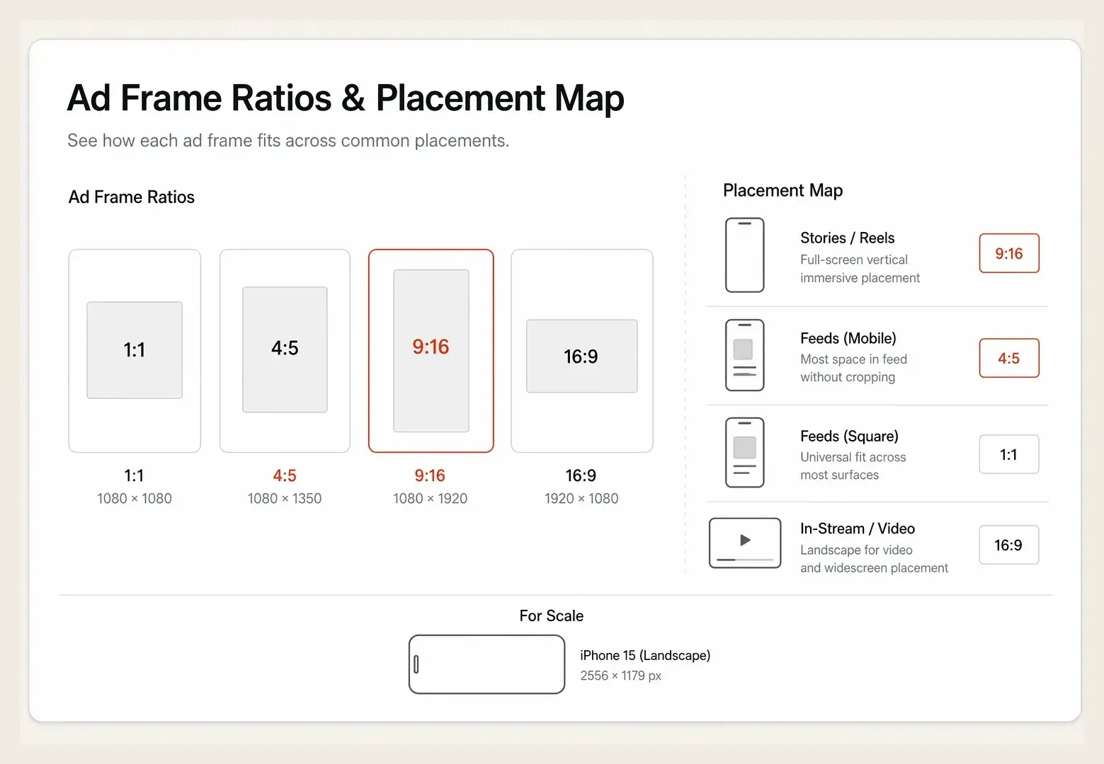
Aspect ratio is the proportional relationship between an ad's width and height, written as width to height, such as 1:1 (square), 9:16 (vertical full screen), 4:5 (vertical feed), or 16:9 (horizontal). It determines how much screen an ad occupies and whether it fits a given placement cleanly. Using the right aspect ratio for each placement is one of the cheapest performance wins in paid media, while using the wrong one shrinks reach and crops the message.
Why It Matters
Aspect ratio decides how much of the screen your creative claims, and screen real estate maps directly to attention. A 9:16 vertical ad fills the entire phone in Stories and Reels, while a 16:9 horizontal ad in the same slot leaves most of the screen empty and the creative small. On mobile, where the large majority of social ad impressions happen, vertical and near-vertical formats consistently capture more attention than letterboxed horizontal ones.
The cost of getting it wrong is quiet but real. When an ad does not match a placement's preferred ratio, platforms either letterbox it (wasting space and lowering impact) or crop it (cutting off the hook, logo, or CTA). Worse, some placements are skipped entirely if the asset does not fit, so the wrong ratio silently narrows distribution. Because the right aspect ratio is mostly a production and export decision, fixing it is far cheaper than fixing targeting or bidding, yet it directly affects both reach and the impact of every creative dollar. It also interacts with the safe zone: even a correctly sized 9:16 asset can have its CTA hidden behind interface elements if the layout ignores where the platform overlays buttons and captions.
How It Works
Aspect ratio works by matching the asset's proportions to the placement's native canvas. Each placement has a preferred ratio, and the closer the asset matches, the more screen it earns and the less the platform has to crop or pad it.
- Map ratios to placements. 1:1 and 4:5 suit feeds, 9:16 suits Stories and Reels, and 16:9 suits horizontal video like in-stream and YouTube.
- Favor vertical on mobile. 4:5 and 9:16 occupy more of a phone screen than 1:1 or 16:9, which lifts attention where most impressions live.
- Design for the safe zone. Keep text, logos, and CTAs clear of the areas where interface elements sit so nothing critical gets covered.
- Export per placement, not once. A single master asset rarely fits every slot, so produce the key ratios rather than letting the platform auto-crop one.
A Real Example
A beauty brand exported every ad as a single 1:1 square and let Meta place it everywhere. In Stories and Reels, the square sat in the middle of the screen with large empty bands above and below, the creative looked small, and the brand was effectively ceding most of the most attention-rich placement on the platform. CTR in those placements lagged the feed by a wide margin, and the team blamed the creative concept.
They re-exported the same concepts into placement-specific ratios: 4:5 for feed and a true 9:16 for Stories and Reels, with text and CTA pulled into the safe zone. Nothing about the creative idea or the offer changed. The full-screen 9:16 versions lifted Stories and Reels CTR by roughly 35% and cut CPA in those placements by about a quarter, because the ad finally filled the screen and kept its message clear of the interface. The fix was an export setting, not a reshoot.
Common Mistakes
| ❌ Mistake | ✅ Better Approach |
|---|---|
| Exporting one ratio and letting the platform auto-crop it everywhere | Export placement-specific ratios so each slot gets a properly fitted asset |
| Running 1:1 or 16:9 in Stories and Reels | Use full-screen 9:16 for vertical placements to claim the whole phone screen |
| Placing text and CTAs anywhere in the frame | Keep critical elements inside the safe zone so the interface never covers them |
How Hawky Helps
Hawky's Creative Agent generates ad creative in the right aspect ratios for each placement from the same brand inputs, so a single concept ships as a clean 4:5 feed asset and a true 9:16 Stories and Reels asset rather than one square the platform crops. It keeps text, logos, and CTAs inside the safe zone for each format, so the hook and call to action survive on every placement. Producing every placement variant by hand is slow, and that friction is exactly why so many accounts default to one cropped ratio.
The Performance Agent reads how each ratio performs by placement and steers delivery toward the formats earning the most efficient results, so the account is not paying for letterboxed creative. Which ratios and layouts win is recorded in FeatherDB, so the next batch of ad creative variations starts already formatted for what works. Hawky produces and optimizes the right formats; it does not just report that an ad got cropped.
Frequently Asked Questions
What aspect ratio is best for Facebook and Instagram ads?
There is no single best ratio; it depends on the placement. Use 4:5 or 1:1 for feed, 9:16 for Stories and Reels, and 16:9 for horizontal in-stream video. On mobile, vertical and near-vertical ratios like 4:5 and 9:16 claim more of the screen and tend to outperform square or horizontal formats, so most accounts should lean vertical for feed and full-screen for Stories.
What is the difference between 4:5 and 9:16?
4:5 is a vertical feed format that occupies more screen than a 1:1 square while still leaving room for the caption and interface in the feed. 9:16 is the full-screen vertical format built for Stories and Reels, filling the entire phone display. Use 4:5 for in-feed placements and a true 9:16 for full-screen vertical placements.
Does aspect ratio affect ad performance?
Yes. The right aspect ratio claims more screen real estate, which lifts attention, and it prevents the platform from letterboxing or cropping the creative in ways that waste space or cut off the hook and CTA. The wrong ratio can also cause some placements to be skipped entirely, narrowing reach. Matching ratio to placement is one of the cheapest ways to improve creative performance.
Why does my ad look cropped or have black bars?
An ad looks cropped or shows black bars when its aspect ratio does not match the placement, so the platform either trims the asset to fit or pads it with empty space. The fix is to export placement-specific ratios, such as 9:16 for Stories and Reels rather than a 1:1 or 16:9 master. Designing within the safe zone also keeps text and CTAs from being covered or cut.
Quick Takeaway
Aspect ratio is the width-to-height proportion that decides how much screen an ad claims, and matching it to each placement is one of the cheapest performance wins available. Export per placement, lean vertical on mobile, and keep critical elements in the safe zone.
Your creative is getting cropped or letterboxed across placements and quietly losing reach. Ready to hire your first AI performance team? Book Demo