Safe Zone
Last updated
The central area of an ad creative kept clear of platform UI elements like buttons, captions, and icons, so your text and CTA never get cropped. Designing inside it prevents wasted spend on messages viewers never see.
Safe Zone
A safe zone is the central area of an ad creative that stays clear of platform interface elements like profile icons, captions, buttons, and progress bars, so your most important text and visuals never get covered or cropped. It is the protected space inside a frame where headlines, logos, and calls to action are guaranteed to stay visible across Stories, Reels, and feed placements. Designing inside the safe zone is what keeps a creative readable on the one screen that matters, the viewer's phone.
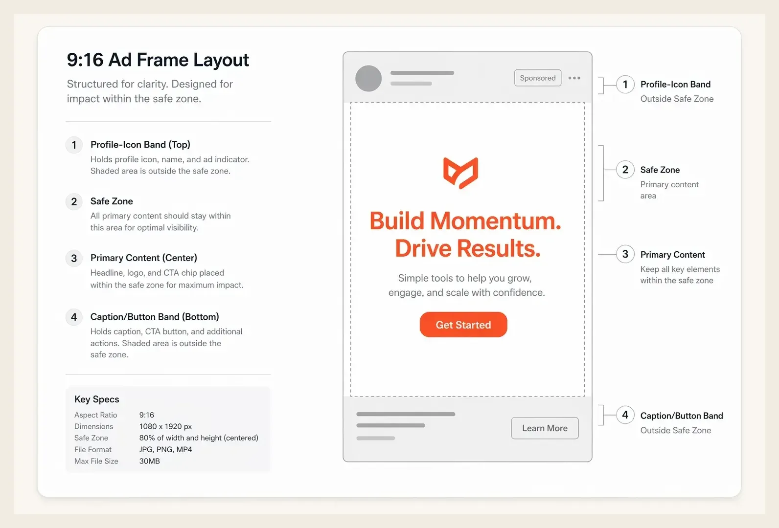
Every social placement overlays its own interface on top of your creative. Instagram Stories puts a profile bubble at the top and a swipe prompt at the bottom. TikTok stacks the caption, username, music ticker, and a column of action buttons over the right and lower thirds of the screen. The safe zone is simply the rectangle left over once you subtract all of that, and it changes by placement.
Why It Matters
A creative can be beautifully designed and still fail because its key message lands under a button. When a price callout, offer, or CTA gets hidden by the platform UI, the viewer never sees the one thing that drives the click. The cost is invisible in your design tool and only appears in the placement, which is why so much wasted spend traces back to layout rather than concept.
The numbers make the stakes clear. Meta recommends keeping text and logos within roughly the central 80 percent of a 9:16 frame, leaving about 250 pixels of margin at the top and 340 pixels at the bottom on a standard 1080 by 1920 canvas. Ignore those margins and a meaningful share of impressions show a cropped message. On a $30,000 monthly budget, even a 10 percent rate of obscured CTAs is real money spent on ads that cannot convert. Respecting the safe zone is one of the cheapest performance fixes available, because it costs nothing but a layout adjustment.
How It Works
The safe zone is defined per placement and per aspect ratio. You design your creative on the full canvas, then keep all critical elements inside the protected center while letting backgrounds and non-essential visuals bleed to the edges.
- Map the UI overlays for each placement. Stories, Reels, and in-feed posts each cover different regions, so a single 9:16 export needs to clear the worst-case overlay.
- Keep text, logos, and CTAs inside the central band. A common rule is a top margin near 14 percent and a bottom margin near 20 percent of the frame height.
- Let backgrounds run full-bleed. Imagery and color can fill the entire frame, since only the message-bearing elements need protection.
- Preview in-platform before launch. Use the ad preview to confirm nothing important sits behind a caption or button on a real device.
The discipline that separates clean creative from cropped creative is testing the export against the actual placement, not the design artboard. A layout that looks centered in your editor can still collide with the music ticker once the platform renders it.
A Real Example
A DTC apparel brand runs a Reels campaign promoting a 24-hour flash sale. The hero creative places "40% OFF TODAY" across the bottom third of the frame, which looks bold and centered in the design file.
Once live, TikTok's caption, share count, and sound label sit directly over that bottom third, partially hiding the discount on a large share of impressions. The campaign posts a CTR of 0.8 percent and stalls. The team re-exports the same creative with the offer moved into the central safe zone, clearing both the top profile area and the bottom action stack.
The relaunched version delivers a 2.4 percent CTR and a 38 percent lower CPC, with no change to the visual style, the offer, or the targeting. The only fix was moving the message out from behind the interface, which proves how much performance can hide inside a layout decision.
Common Mistakes
| ❌ Mistakes | ✅ Better Approach |
|---|---|
| Center text in the design tool and assume it is safe everywhere | Check the message against each placement's UI overlay before exporting |
| Use one 9:16 export for Stories, Reels, and TikTok alike | Account for the worst-case overlay so the CTA clears every placement |
| Push the logo or CTA to the very bottom edge for emphasis | Keep critical elements inside the central 80 percent and let only backgrounds bleed |
How Hawky Helps
Layout problems are creative problems, and Hawky's Creative Agent generates ad variations that respect placement safe zones from the start, keeping hooks, offers, and CTAs inside the protected band rather than under a button. It produces placement-aware versions of a winning concept so the same idea reads cleanly in Stories, Reels, and feed without a manual re-export for each one.
Because Hawky runs as a team of agents, the Performance Agent watches how those placement variants actually perform and shifts budget toward the ones converting, while FeatherDB remembers which layouts and safe-zone treatments held up in your account. That turns safe-zone compliance from a checklist into a learned pattern the agents apply to every new creative.
Frequently Asked Questions
What is the safe zone in Instagram Stories?
The safe zone in Instagram Stories is the central portion of the 9:16 frame that stays clear of the profile icon at the top and the "Send message" bar and swipe prompt at the bottom. Meta advises keeping text and logos roughly 250 pixels from the top and 340 pixels from the bottom on a 1080 by 1920 canvas so nothing critical gets covered.
What is the TikTok safe zone for ads?
The TikTok safe zone avoids the right-side column of action buttons and the lower area holding the caption, username, and music ticker. Keep your key message and CTA in the upper-center and central region of the frame, since the bottom third and right edge are the most heavily covered by the interface.
What size is the ad safe zone?
For a standard 1080 by 1920 vertical creative, a reliable safe zone keeps critical elements out of roughly the top 14 percent and bottom 20 percent of the frame, leaving the central band for text and CTAs. Exact margins vary by placement, so the safest approach is to clear the worst-case overlay across the placements you are running.
Does the safe zone apply to feed ads too?
Yes, though feed placements cover less of the creative than Stories or Reels. In-feed ads still overlay captions, the account name, and engagement icons, so keeping text away from the extreme top and bottom edges protects readability across both feed and full-screen placements.
Quick Takeaway
The safe zone is the protected center of an ad frame where your message stays visible above the platform UI, and designing inside it prevents the silent waste of CTAs that disappear behind buttons and captions.
When a campaign underperforms for no obvious reason, the message is often hiding behind the interface, and an agent should be building creative that clears it. Ready to hire your first AI performance team? Book Demo