Visual Hierarchy
Last updated
The deliberate arrangement of ad elements by size, color, contrast, and position so the viewer's eye lands on the most important thing first. With viewers forming an impression in about 50 milliseconds, hierarchy can swing CTR dramatically on identical copy.
Visual Hierarchy
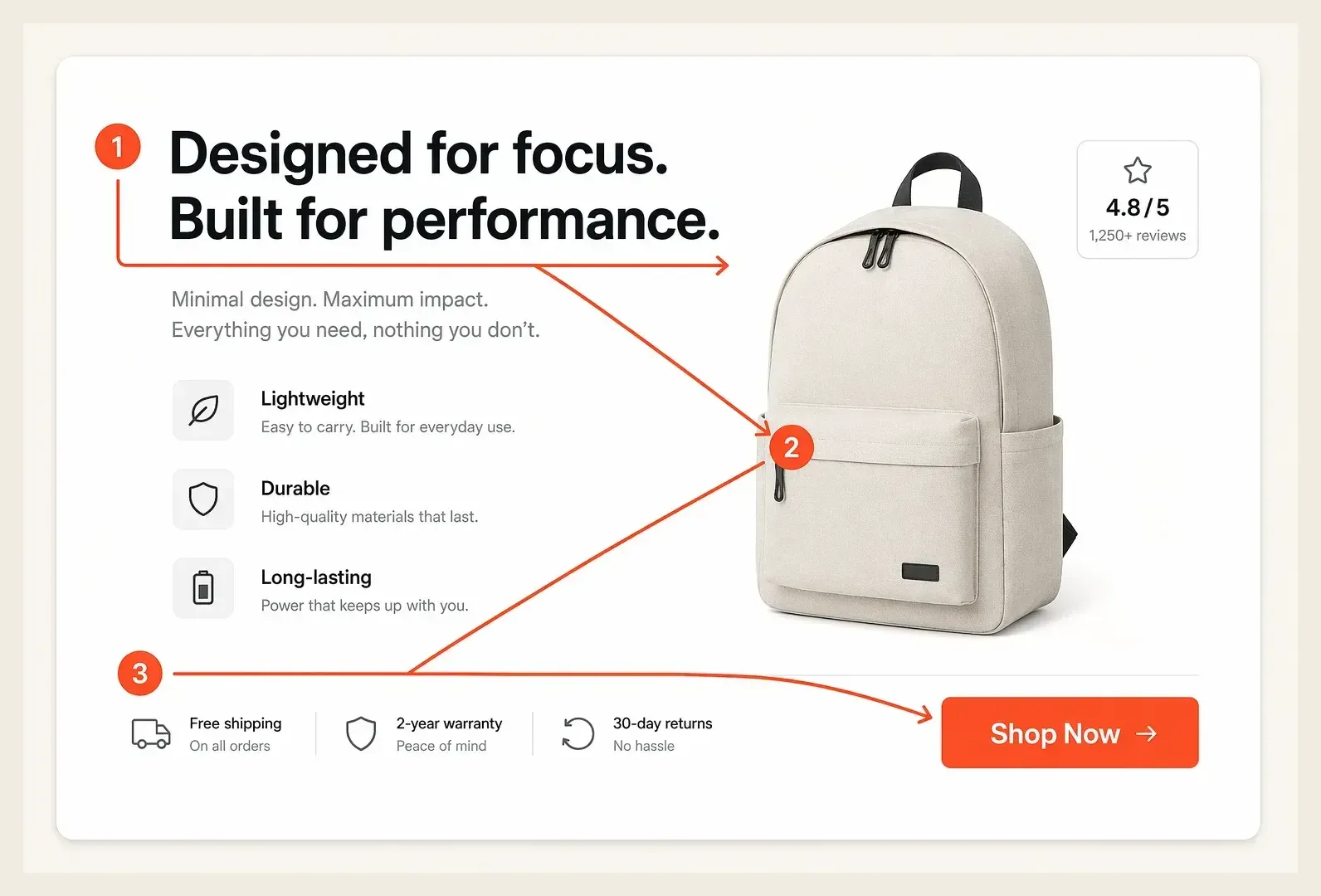
Visual hierarchy is the deliberate arrangement of elements in an ad so the viewer's eye lands on the most important thing first, then moves through the message in the order you intend. It uses size, color, contrast, spacing, and position to rank what gets noticed, guiding attention from the hook to the value proposition to the call to action without the viewer having to work for it. In an ad that has roughly a second to register, visual hierarchy is what decides whether the message lands or gets scrolled past.
Why It Matters
Visual hierarchy matters because attention is brutally scarce and unevenly distributed. Eye-tracking research shows people form a first impression of a visual in about 50 milliseconds, and on a busy feed an ad gets a fraction of a second to communicate its core idea. If the eye does not immediately find the point, the ad is gone, no matter how good the offer is.
Strong hierarchy directly lifts performance because it removes cognitive load. When the hook, benefit, and call to action are ranked clearly, the viewer absorbs the message in the intended order and the CTR rises, while a flat, cluttered ad where everything competes for attention causes the eye to bounce. Hierarchy is also what makes a value proposition actually get read instead of buried, which is why two ads with identical copy can perform completely differently based on layout alone.
How It Works
Visual hierarchy works by using a handful of design levers to rank elements, so the most important one is seen first and the rest fall in a clear order. The eye is drawn to whatever is biggest, boldest, most contrasting, and most isolated.
- Size and scale: the largest element reads first, so the headline or key benefit should dominate.
- Color and contrast: a high-contrast accent (often on the CTA) pulls the eye to the action.
- Whitespace and spacing: isolating an element with space makes it stand out more than crowding it.
- Position and flow: people scan in predictable patterns (Z and F shapes), so place key elements along that path.
Because the levers compound, restraint matters. An ad that tries to emphasize everything emphasizes nothing, so effective hierarchy means choosing one clear focal point and letting contrast and spacing support it rather than fighting it. The discipline is subtraction as much as arrangement.
A Real Example
A DTC apparel brand runs a static ad where the logo, three product shots, a discount badge, and a long headline all compete at similar size. It returns a 0.7% CTR, and heatmap data shows the eye scattering with no clear path, never settling on the offer.
The team rebuilds the creative with a clear hierarchy: one hero product image dominates, the benefit headline sits large at the top of the Z-pattern, and a single high-contrast button anchors the bottom right. Nothing else competes. The same offer and copy, restructured, returns a 1.8% CTR and a stronger landing page CVR, because viewers now read the message in the right order. The win came from arrangement, not a new offer.
Common Mistakes
| ❌ Mistakes | ✅ Better Approach |
|---|---|
| Make every element the same size so nothing leads | Choose one dominant focal point and rank the rest |
| Bury the call to action in low contrast | Give the CTA the highest contrast on the creative |
| Crowd the ad edge to edge with no whitespace | Use spacing to isolate and elevate the key element |
| Ignore natural scan patterns when placing elements | Position the hook and CTA along the Z or F path |
How Hawky Helps
Visual hierarchy is a creative-craft variable, and getting it right at scale means testing many arrangements fast. Hawky's Creative Agent generates ad variants with different hierarchies, varying which element dominates, where the CTA sits, and how contrast and spacing rank the message, then learns which arrangements actually earn the click for your audience. It treats layout as a testable lever rather than a one-time design decision.
Through element-level analysis, the Creative Agent isolates whether a weak result comes from the hook, the layout, or the offer, so a flat-performing ad gets diagnosed instead of guessed at, and fresh variants ship before creative fatigue compounds the problem. Hawky's Performance Agent then routes budget to the layouts holding the lowest cost per result. Both agents read from FeatherDB, the account's living memory of which hierarchies converted, so good layout decisions compound across every future ad.
Frequently Asked Questions
What is visual hierarchy in advertising?
Visual hierarchy in advertising is the intentional ranking of ad elements through size, color, contrast, spacing, and position so the viewer notices the most important thing first and moves through the message in the intended order. It guides the eye from the hook to the value proposition to the call to action, which is critical when an ad has under a second to register.
How do you create visual hierarchy in an ad?
You create visual hierarchy by choosing one dominant focal point, then using scale, high contrast, and whitespace to rank everything else beneath it. Make the key benefit or hook the largest element, give the CTA the strongest contrast, isolate important pieces with space, and place them along natural scan patterns like the Z or F shape.
Why does visual hierarchy affect ad performance?
Because viewers form an impression in roughly 50 milliseconds, a clear hierarchy lets them absorb the message instantly, which lifts CTR, while a flat, cluttered layout makes the eye bounce before the offer registers. Two ads with identical copy can perform very differently based purely on how their elements are ranked and arranged.
What are the key elements of visual hierarchy?
The core levers are size and scale, color and contrast, whitespace and spacing, and position and reading flow. Used together, they tell the eye what to read first and in what order. The discipline is restraint, since emphasizing one clear focal point works far better than trying to make every element stand out at once.
Quick Takeaway
Visual hierarchy decides what the viewer sees first and in what order, and it can swing CTR dramatically on identical copy by guiding the eye instead of letting it scatter. Let a Creative Agent test which layouts convert and isolate whether a weak ad is failing on hierarchy, hook, or offer.
When your ads have the right message but the wrong arrangement, the fix is a Creative Agent that tests hierarchies and finds the layout that lands. Ready to hire your first AI performance team? Book Demo