Hawky Dashboards: The Performance Marketer's Dashboard That Tells You What to Do

Hawky Dashboards is a performance marketer's dashboard built to do one thing above everything else: take you from spotting a problem, to understanding exactly what caused it, to acting on it, in a few clicks instead of a few days of digging.
Most performance teams do not have a data problem. They have a time problem. Marketers lose between 6 and 10 hours a week to manual data pulling and reporting, and nearly half of marketing leaders say more time goes into preparing data than analyzing it. Hawky Dashboards was built to give those hours back.
Let's be blunt about what it is not. Hawky Dashboards is not a creative analytics dashboard. Every leader in that category uses the same label, and they all stop at the same place: a prettier chart of what already happened. Hawky Dashboards is a performance marketer's dashboard. It updates in real time, it explains why a number moved, and it tells you what to do next.
Is Hawky Dashboards a creative analytics dashboard?
No, and that distinction is the entire point. A creative analytics dashboard consolidates ad spend, impressions, clicks, conversions, ROAS, CPL, and creative-level metrics into one workspace so teams can read performance without rebuilding reports by hand. Hawky Dashboards does all of that, then crosses the line the category never crosses: it updates live, an AI Copilot explains why performance changed, and Hawky's agents can act on it.
So call it what it actually is. A performance marketer's dashboard, built for the person who has to make the next decision, not just describe the last one.
A dashboard, but not the stale kind
The word "dashboard" carries baggage. People assume it means yesterday's numbers, a once-a-day refresh, or data already too old to act on. Here that assumption is exactly backwards.
Hawky Dashboards updates in real time. As your creatives and campaigns change, spend, results, and creative-level metrics move with them, so you are reading the account as it is right now, not as it was this morning. At high spend, where fatigue can set in within 7 to 10 days and a single day of drift costs real money, that is the difference between catching a problem early and reading about it in Monday's report.
Why a dashboard has to tell you what to do
Dashboards describe the past. That is useful, but a chart that shows CPL climbing does not tell you which creatives caused it or what to launch instead. For years, the answer was to export the data, pivot it in a spreadsheet, and reason about it manually.
Hawky's view is simple. Reporting with a prettier chart is still reporting. The job is analysis that ends in action, and that is the line Hawky Dashboards is built to cross. The dashboard surfaces what is happening, Copilot explains why, and Hawky's Performance Agent and Creative Agent can act on it.
That distinction matters because creative performance moves fast. A dashboard is only worth opening if it shortens the distance between insight and decision.
See what is happening, in real time
The first half of Hawky Dashboards is about visibility: seeing live trends, slicing them by the dimensions that matter to you, and keeping the views you build. Each capability below is live now.
Custom dashboards
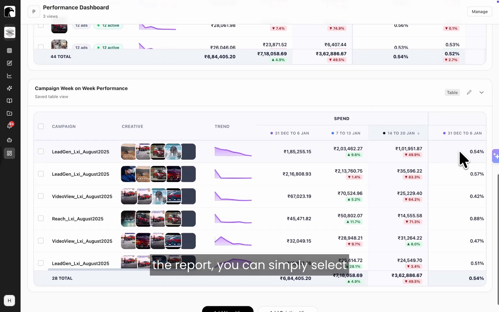
Custom dashboards are the workspace a performance marketer actually runs the account from. Instead of one fixed report, you combine the views that matter to you, a campaign performance comparison, an ad performance report, a top creatives report, and an influencer report, into a single board shaped around how you run the account.
As you build new views, you add them to the board, so the dashboard becomes a control room built around your decisions rather than a vendor's template. That mirrors the unified-control idea behind Hawky's Command Center, applied to your own reporting.
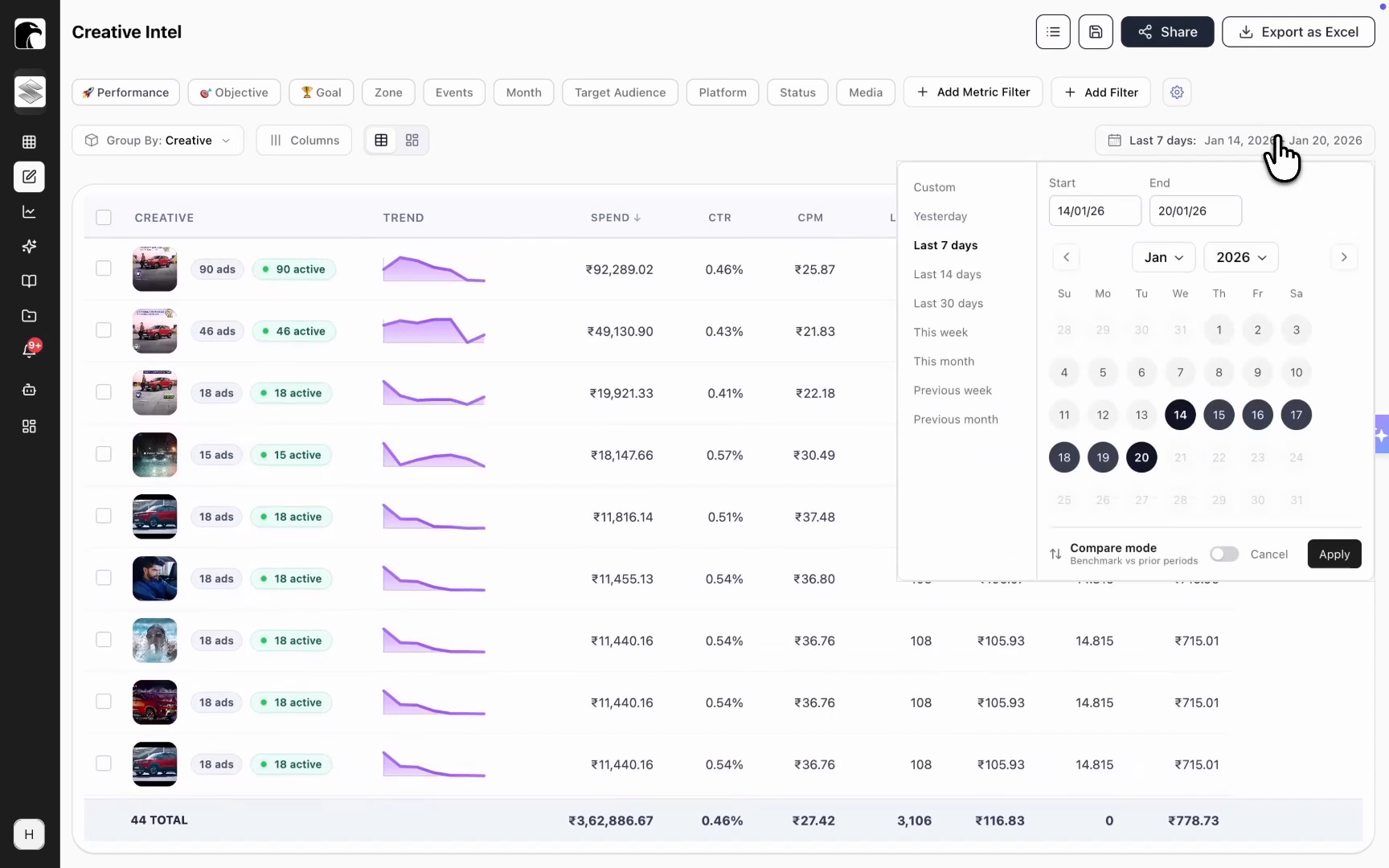
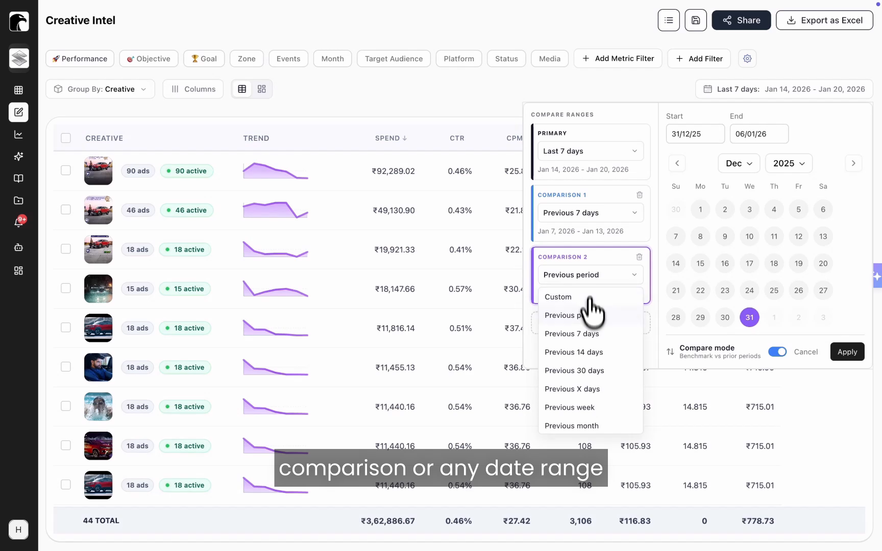
Period-over-period performance comparison
Period-over-period comparison measures one date range against another so you can see direction, not just a single snapshot. Compare the last 7 days with the prior 7 days, stack an additional period in front of that, or pick any custom date range. You can line up as many periods as you need.
This makes week-over-week trends obvious. You spot a performance drop the moment it starts and catch a growing trend while there is still budget to push behind it.
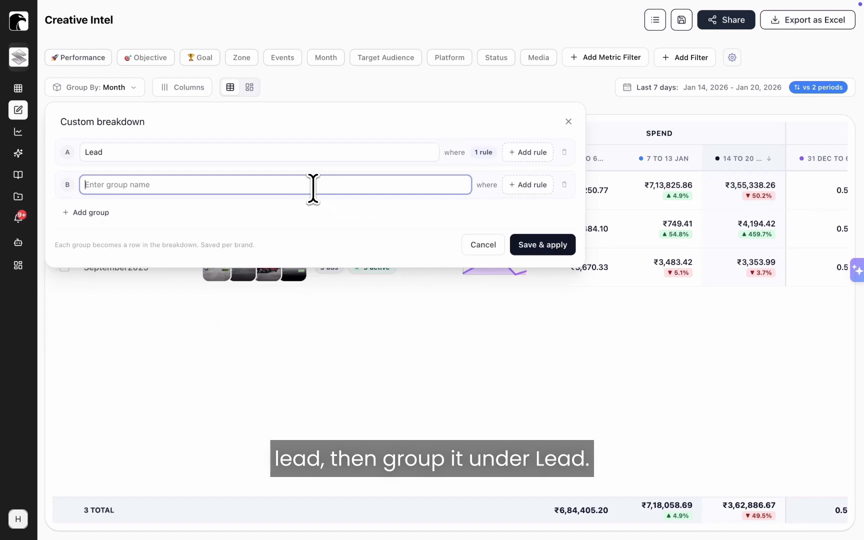
Custom grouping with your own naming conventions
Most teams already encode strategy into campaign and ad set names: funnel stage, audience type, objective, geography, or targeting approach. Hawky Dashboards reads that nomenclature and groups performance by it, so your naming convention becomes an analysis dimension.
If a dimension is not already a filter in the platform, you build your own breakdown with simple rules. If the name contains "lead," group it under Lead. If it contains "reach," group it under Reach. The dashboard then aggregates spend and results under each group, so you can see how lead-gen campaigns performed against reach campaigns at a strategic level.
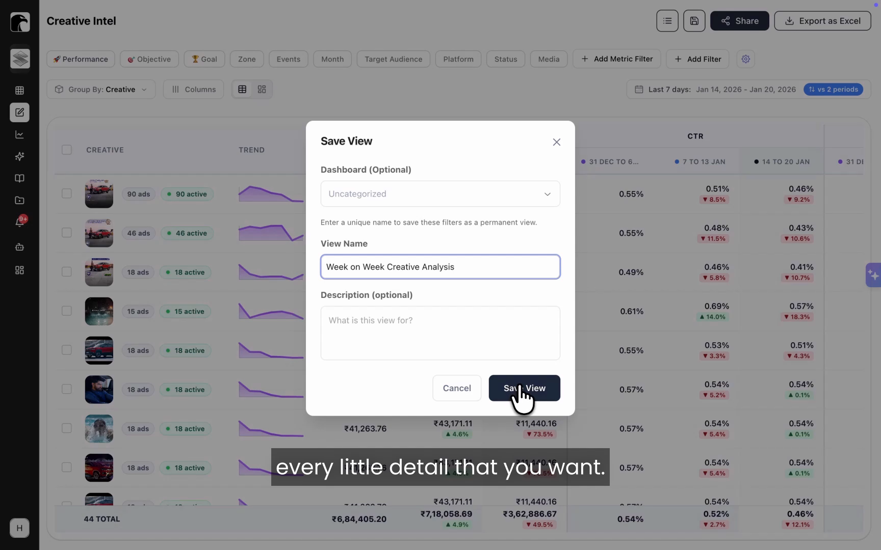
Saved views
A saved view preserves an entire dashboard configuration (filters, date comparisons, breakdowns, and metrics) so you can return to it in one click. Teams lose real time rebuilding the same setup every session, then rebuilding it again to switch perspectives.
With saved views, that work happens once. Build a campaign week-on-week view, an ad-level performance view, and a creative-level comparison view, save each, and switch between them instantly. Saved views are also the building blocks you drop into a custom dashboard.
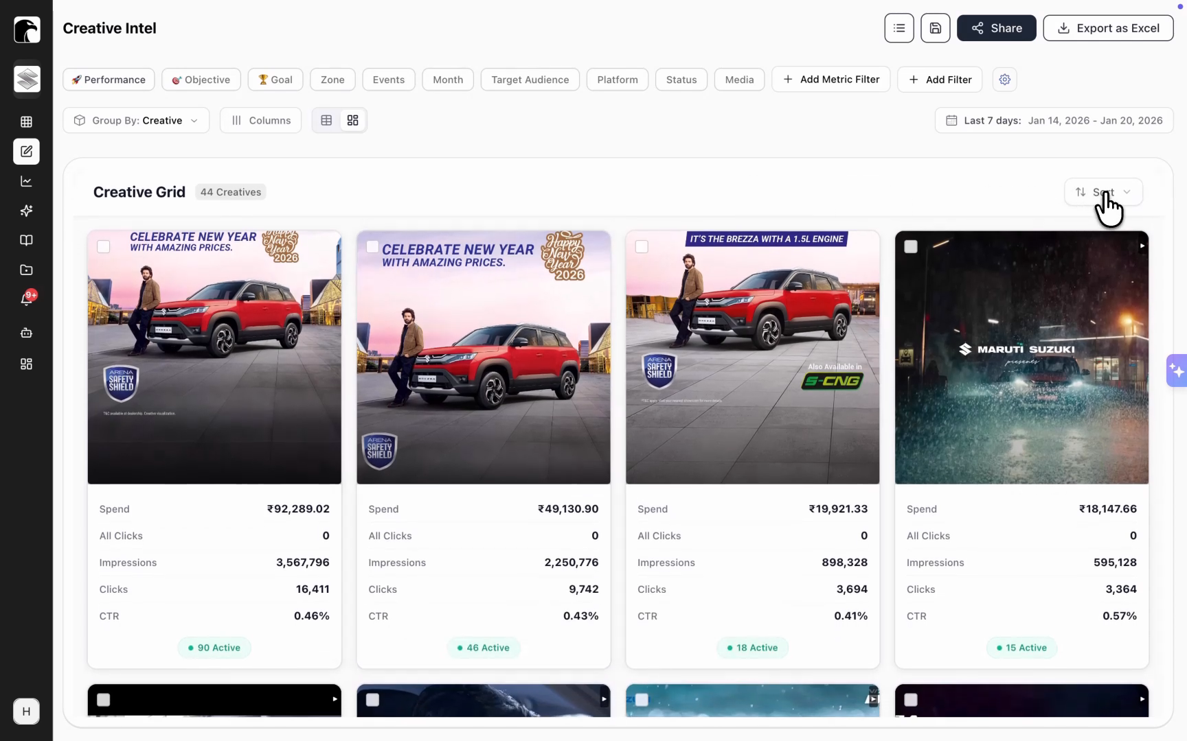
Creative grids
A creative grid is a card-based layout that shows creatives as visuals instead of table rows. A spreadsheet is the wrong format when the thing you are evaluating is an image or a video.
Switch to the grid to scan top performers and top spenders at a glance, and sort by spend, impressions, or any metric that matters to you. It turns creative review into a visual process, which is how creative teams actually work. For deeper element-level breakdowns, the grid connects to Hawky's Creative Analysis.
Here is what the analysis layer covers at a glance.
| Capability | What it does | The decision it speeds up |
|---|---|---|
| Custom dashboards | Combines your saved views into one live workspace | Reviewing the whole account from one control room |
| Period-over-period comparison | Compares unlimited date ranges side by side | Is performance trending up or down, and since when |
| Custom grouping | Groups performance by your campaign naming conventions | Which funnel stage, audience, or geo is winning |
| Saved views | Recalls any filter and breakdown setup in one click | Switching perspectives without rebuilding reports |
| Creative grids | Shows creatives as sortable visual cards | Which creatives to scale or cut |
Go from what happened to why, and what to do next
Visibility is half the job. The other half is closing the gap between a number that looks wrong and the action that fixes it. This is where Copilot and the launch-date filters come in.
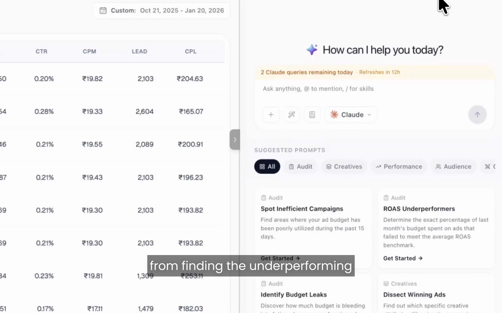
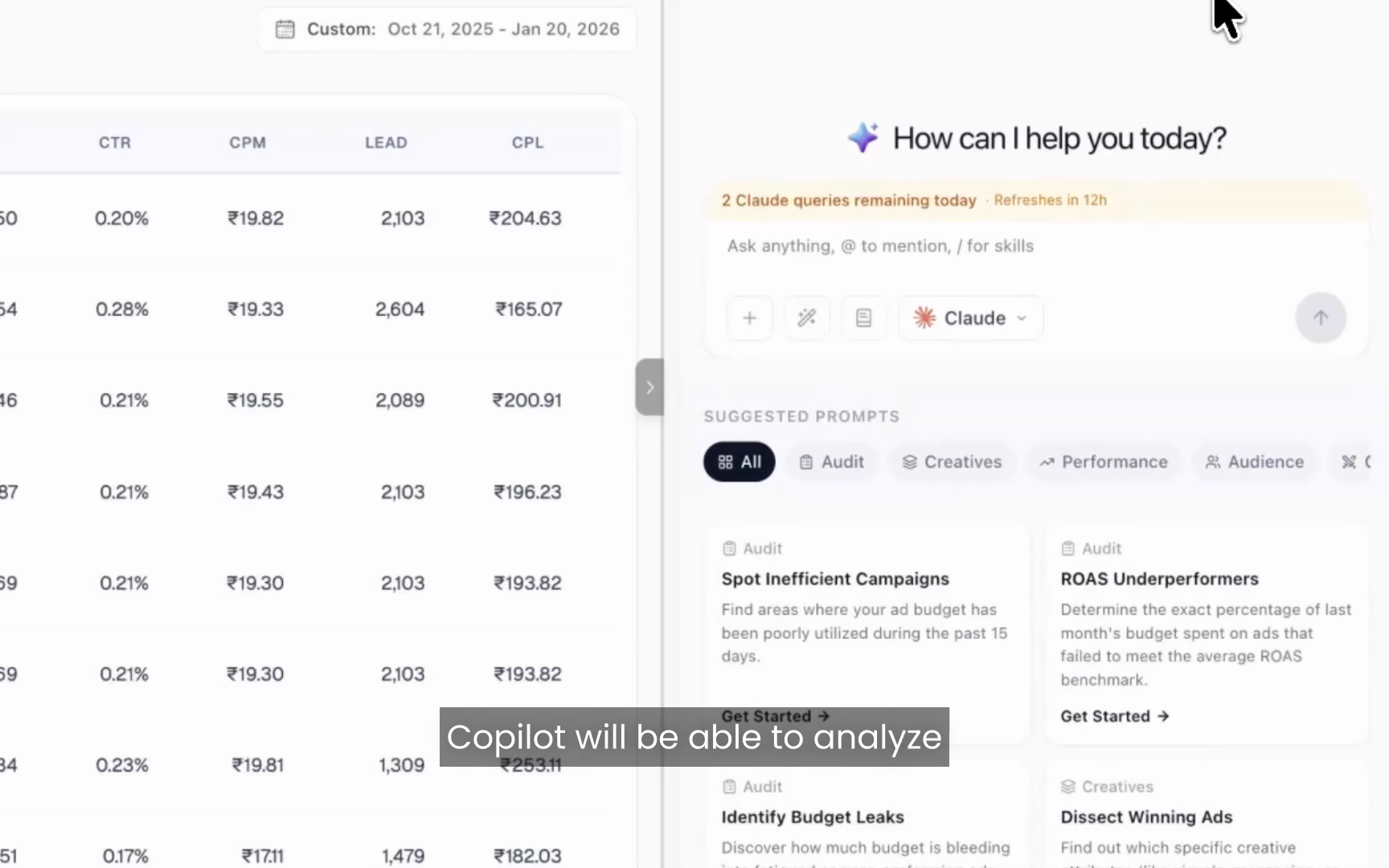
Copilot, built into the dashboard
Copilot is an AI performance partner that investigates a campaign or creative and returns a sourced answer, not just a chart. When you notice a campaign with a sudden drop in CPM or a spike in CPL, you select it, add it to Copilot, name it, and ask a question.
In one example from the demo, Copilot identified two root causes behind a campaign's decline: creative fatigue across several ads and a falling lead conversion rate. It named the specific creators driving the issue, explained the reasons behind the drop, and recommended how to recover CPL. That is analysis that ends in a next step.
Launch date filter
The launch date filter isolates creatives by when they entered the account, using either creative launch time or ad launch time. A single creative asset often runs across many ads, which makes it hard to track when that creative was actually first introduced.
Filter to creatives launched in the last 14 days, for example, and you see only the fresh ones. That alone solves a tracking problem that usually requires a spreadsheet and a good memory.
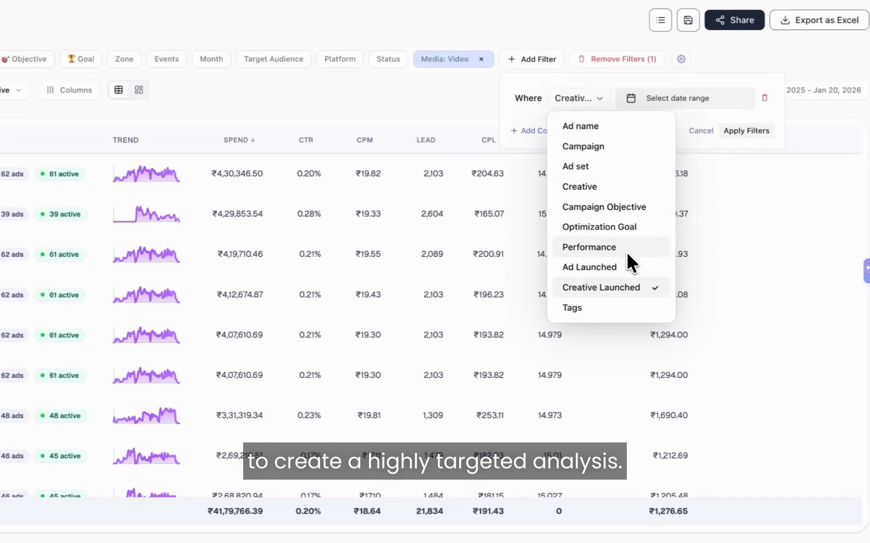
Launch date plus performance filters
Combining the launch date filter with performance filters creates a highly targeted creative analysis in one query. You define the exact cohort you care about, then act on it.
Ask for creatives launched in the last 14 days that have spent more than 5,000 and carry a CPL above your target benchmark. The dashboard returns your underperforming new creatives, or flip the filters to surface the new winners worth scaling. From there, hand the cohort to Copilot.
A real workflow: find underperforming new creatives and fix them
Here is the loop end to end, the way a media buyer would run it. The point is speed: from finding a problem to a recommendation in a few clicks instead of a few hours.
Step 1. Filter to fresh creatives. Apply the launch date filter for the last 14 days so you only see creatives recently introduced into the account.
Step 2. Layer on performance filters. Add spend greater than 5,000 and CPL above your benchmark. You now have a clean list of new creatives that are burning budget without hitting the target.
Step 3. Send the cohort to Copilot. Select those creatives and ask why they are performing poorly, or what patterns appear across them. Copilot analyzes the selected creatives, identifies likely causes, highlights common themes, and recommends next steps.
Step 4. Act on the answer. Pause the worst offenders, brief replacements based on the patterns Copilot found, or route the work to Hawky's Creative Agent to generate on-brand alternatives from your winners.
This workflow matters most around fatigue, because timing drives the cost. The fresher your read on creative performance, the earlier you catch decay. Because the dashboard updates in real time, that read is always current. General fatigue timelines look like this:
| Daily spend / audience | Typical time to fatigue | What to do |
|---|---|---|
| 100 to 200/day, broad audience | 2 to 3 weeks | Monitor weekly, refresh on signal |
| 1,000+/day | 7 to 10 days | Check every few days, queue replacements |
| Small retargeting audience | 3 to 5 days | Rotate creatives proactively |
Benchmarks vary by account, and Meta recommends refreshing on signal rather than on a fixed calendar. Hawky Dashboards gives you that signal in real time, and Copilot tells you what to do with it.
Where Hawky Dashboards fits with the agents
Hawky Dashboards is the analysis layer of an agentic performance marketing platform, not a standalone reporting tool. The dashboard and Copilot show you what is happening and why. The agents change what happens next.
Hawky's Performance Agent plans, launches, and optimizes Meta, Google, and YouTube campaigns against your KPI, with every move logged and one-click reversible. The Creative Agent reads your winners and renders on-brand replacements when fatigue or a CPL spike shows up. Autonomy is configurable: you choose the gate, from shadow mode to approval-gated to fully autonomous, with the same audit trail throughout. That keeps the autonomy trustable rather than reckless.
The payoff compounds. Brands running Hawky have cut CPL by 27% and saved more than 160 hours per brand each month, and earlier fatigue signals help teams catch creative decay 4 to 7 days sooner.
Frequently asked questions
Is Hawky Dashboards a creative analytics dashboard? No. The category leaders all use that label and stop at showing you what happened. Hawky Dashboards is a performance marketer's dashboard: it updates in real time, explains why performance changed, and recommends what to do next, with Copilot and Hawky's agents built in.
Is the dashboard updated in real time? Yes. Hawky Dashboards updates in real time as your creatives and campaigns change, so you are never working from yesterday's numbers or waiting on a once-a-day refresh.
How is Hawky Dashboards different from a normal ad reporting dashboard? A normal reporting dashboard shows what happened, often on delayed data. Hawky Dashboards updates live, adds Copilot to explain why it happened and what to do next, and connects to Hawky's agents that execute the fix. The goal is analysis that ends in action, not another chart to interpret manually.
Can I compare any custom date ranges? Yes. Period-over-period comparison supports the last 7 days against the prior 7, additional stacked periods, or any custom date range, with no limit on the number of periods you compare.
Can I group campaigns by my own naming conventions? Yes. Hawky Dashboards reads the nomenclature in your campaign and ad set names and groups performance by it. You can also create custom breakdowns with rules, such as grouping every campaign whose name contains "lead" under a Lead group.
How does Copilot find the root cause of a performance drop? You select the campaign or creatives in question and ask Copilot a question. It analyzes the selected entities, identifies likely causes such as creative fatigue or a falling conversion rate, names the specific drivers, and recommends next steps, with sources behind each insight.
Does it work for both Meta and Google ads? Yes. Hawky operates across Meta, Google, and YouTube, so the dashboard, comparisons, and Copilot analysis span the platforms where performance teams run spend.
Get started
If your team is spending hours rebuilding reports and still cannot say why CPL moved last week, Hawky Dashboards and Copilot are built for exactly that job. The dashboard shows in real time how performance is trending, Copilot finds the root cause, and Hawky's agents take it from there.
Ready to hire your first AI performance team? Book Demo