Anatomy of a Facebook Ad: The 8 Parts and What Each One Does
A Facebook ad has eight visible parts: the page name and profile picture, the "Sponsored" label, the primary text, the creative (image or video), the headline, the description, the display link, and the call to action button. A ninth element, the social proof row of reactions, comments and shares, appears only once the ad has earned engagement.
Every one of those parts is a field you fill in inside Ads Manager, and every one of them can be the reason an ad works or dies. Most advertisers obsess over the image and leave the other seven on autopilot.
This guide labels each part, gives Meta's own character limits, shows which fields quietly disappear depending on placement, and explains which components actually move performance.
What are the parts of a Facebook ad?
A Facebook ad is assembled from eight fields that Meta renders in a fixed order, and the order never changes even when individual fields do not appear. Reading top to bottom, the feed unit runs: identity, then copy, then creative, then the link module, then engagement.
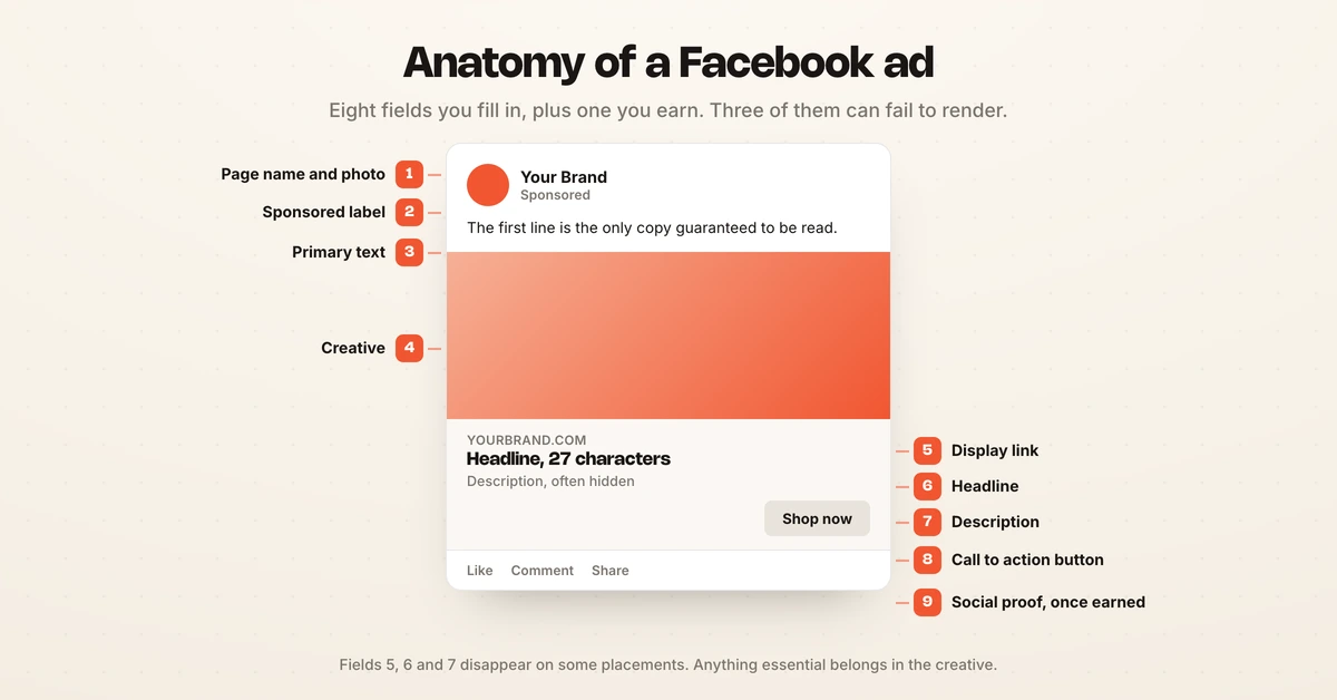
| # | Part | Where it comes from | Can it be hidden? |
|---|---|---|---|
| 1 | Profile picture and page name | Your Facebook Page, not the ad | No |
| 2 | "Sponsored" label | Added by Meta automatically | No |
| 3 | Primary text | The ad's Primary text field | Truncates after ~125 characters |
| 4 | Creative (image or video) | Your uploaded asset | No |
| 5 | Headline | The Headline field | Hidden in some placements |
| 6 | Description | The Description field | Often not rendered at all |
| 7 | Display link | Derived from your destination URL | Hidden in some placements |
| 8 | Call to action button | Chosen from Meta's fixed list | Optional, rarely worth omitting |
| 9 | Social proof row | Earned, not entered | Absent until engagement exists |
The important column is the last one. Three of the eight fields you write can fail to appear, which means copy you laboured over may never reach the person scrolling.
The eight parts, one by one
Each part answers a different question for the person scrolling, which is why treating them as one blob of "ad copy" underperforms.
1. Profile picture and page name
The page name is the advertiser's identity and it is inherited from the Facebook Page running the ad, not set per ad. It is the first trust signal in the unit, and it is the reason a new page with no followers converts worse than an established one at identical creative quality.
2. The "Sponsored" label
Meta inserts this automatically beneath the page name and it cannot be removed, restyled or worded differently. It is the disclosure that separates an ad from an organic post, and it sits under Meta's advertising standards rather than being an ad setting you control.
3. Primary text
Primary text is the body copy that sits above the creative, and it is the field with the most room and the most risk. Meta recommends 50 to 150 characters for feed image ads.
Longer text is allowed, but the feed truncates it after roughly 125 characters and collapses the rest behind a "See more" link. Anything after that point is read only by people who already decided to keep reading, so the hook belongs in the first line. The best Facebook ad hooks are built for exactly this constraint.
4. The creative
The creative is the image or video, and it is the only part of the ad that stops the scroll. Meta recommends a 4:5 ratio at 1440 x 1800 pixels for the feed, which claims the most vertical screen space without cropping. Full dimensions for every placement live in the Facebook ad sizes guide.
Video carries an extra sub-anatomy: the first frame, the first three seconds, and the thumbnail shown before autoplay. Hook rate measures how well that opening does its job.
5. Headline
The headline is the bold line directly beneath the creative and Meta recommends 27 characters. It is the most frequently wasted field in the unit, because advertisers repeat the brand name there instead of stating the offer.
6. Description
The description sits under the headline in smaller grey text, and in the Facebook feed it frequently does not render at all. Meta does not publish a recommended length for it on the feed image ad spec, which is itself the tell. Write it as a bonus, never as load-bearing copy.
7. Display link
The display link is the domain pulled from your destination URL, shown in grey near the headline. You cannot invent one, and a mismatch between the display domain and the landing page is a common cause of policy review.
8. Call to action button
The CTA button is picked from a fixed list Meta maintains, including Shop now, Learn more, Sign up, Book now, Download and Get offer. You cannot write custom button text. The button is the only part of the ad users expect to be clickable, so removing it reliably costs clicks.
What does a Facebook ad look like?
A Facebook feed ad looks almost identical to an organic post, which is the entire design intent: the only structural differences are the "Sponsored" label and the call to action bar beneath the creative.
That similarity is deliberate. Meta wants paid units to sit natively in the feed rather than announce themselves, which is why ads that look like ads tend to underperform ads that look like content.
The fastest way to see your own copy in the real layout before it ships is to mock it up. Paste your primary text, headline and creative into the Facebook ad mockup generator and you will see exactly where the truncation falls and whether the description renders.
How the anatomy changes by placement
The eight parts are a feed description, and the feed is only one of the places the same ad runs. Placements strip the unit down rather than rearranging it.
| Placement | Primary text | Headline | Description | CTA button |
|---|---|---|---|---|
| Facebook feed | Shown, truncated ~125 chars | Shown | Usually hidden | Shown |
| Instagram feed | Shown, truncated ~125 chars | Shown, up to 40 chars | Not shown | Shown |
| Stories | Not shown | Not shown | Not shown | Swipe-up bar |
| Reels | Overlaid, heavily truncated | Not shown | Not shown | Shown |
| Right column | Not shown | Shown | Not shown | Not shown |
Instagram is the trap here, because the limits differ rather than disappear: Meta's Instagram feed spec allows a 40-character headline against Facebook's 27, so a headline written to the Facebook limit is not automatically right on Instagram. Stories drops almost everything but the creative. The practical consequence is that an ad optimised for the Facebook feed can arrive in Stories or Reels with its sharpest line deleted, so anything essential belongs burned into the creative rather than typed into a text field.
Which parts actually drive performance
The creative decides whether the ad is seen, and the headline and CTA decide what happens next, which is why creative earns the majority of testing effort in most disciplined accounts.
- The creative carries the scroll stop. It is the highest-variance element and the one worth testing most often, because creative fatigue sets in here first.
- The first line of primary text carries the hook, and it is the only copy guaranteed to be read.
- The headline carries the offer, and it is the cheapest element to test since no design work is needed.
- The CTA button carries intent matching. Shop now on a cold audience asks for a commitment the person has not agreed to yet.
- The description and display link carry almost nothing, because they frequently do not render.
Creative Analysis scores each of these elements against your own winners, which turns the ranking above from an opinion into an account-specific answer. Ranking them this way matters because testing budget is finite. A team running headline tests while the creative sits untouched for six weeks is optimising the wrong layer, which is the pattern the Facebook ads optimization guide works through.
Character limits and where text gets cut
Meta publishes recommendations rather than hard caps for most fields, and the recommendation is the point at which truncation starts rather than the point at which upload fails.
| Field | Meta's recommendation | What happens past it |
|---|---|---|
| Primary text | 50 to 150 characters | Collapses behind "See more" around 125 |
| Headline | 27 characters | Wraps, then truncates with an ellipsis |
| Description | Not published for feed image ads | Frequently not rendered at all |
Two practical rules follow. Put the hook in the first 125 characters of primary text, and treat the 27-character headline as a hard design constraint rather than a suggestion, because a truncated headline loses the end of the offer.
Facebook ad anatomy versus an organic Facebook post
An organic Facebook post has four parts: page identity, body text, creative, and the engagement row. An ad adds four more: the Sponsored label, the headline, the description, and the call to action button.
| Organic post | Facebook ad | |
|---|---|---|
| Page name and photo | Yes | Yes |
| Body text | Yes | Yes, called Primary text |
| Creative | Yes | Yes |
| Sponsored label | No | Yes, automatic |
| Headline | No | Yes |
| Description | No | Yes |
| Display link | Link preview only | Yes |
| CTA button | No | Yes |
| Reactions, comments, shares | Yes | Yes, once earned |
The four extra fields are what make an ad an ad. They are also why boosting a post is not the same as running an ad: a boosted post inherits the organic structure and leaves the link module underbuilt.
How to check your own ad's anatomy before launch
Reviewing the unit as a whole, rather than field by field inside Ads Manager, catches most of the errors that reach live accounts.
- Preview every placement, not just the feed. Ads Manager lets you cycle placements in the preview pane, and the headline disappearing on Instagram is the most common surprise.
- Read only the first 125 characters of your primary text and ask whether the ad still makes its case.
- Check the display domain matches the landing page, since a mismatch invites policy review.
- Compare against live competitor units in the Facebook Ad Library to see which fields rivals actually fill.
The reason this review rarely happens is time. Checking eight fields across five placements on every ad in a large account is a job nobody has capacity for weekly, which is where Hawky's Creative Agent fits: it produces finished, on-brand variants bound to a specific campaign and ad set, each carrying the evidence behind it, with seat-level approval before anything ships.
Frequently asked questions
What are the parts of a Meta ad?
A Meta ad has eight visible parts: the page profile picture and name, the Sponsored label, the primary text, the creative, the headline, the description, the display link, and the call to action button. A social proof row of reactions, comments and shares appears once the ad earns engagement. The same anatomy applies across Facebook and Instagram, though Instagram hides the headline and description.
What are the four parts of an ad?
Reduced to essentials, an ad has four parts: the identity showing who is advertising, the copy making the argument, the creative stopping the scroll, and the call to action telling the person what to do next. Facebook splits the copy across primary text, headline and description, and splits the action across the CTA button and display link, which produces the eight fields in Ads Manager.
What does a Facebook ad look like?
A Facebook feed ad looks like an organic post with two additions: a "Sponsored" label under the page name, and a call to action bar beneath the creative containing the headline, description and button. The resemblance is deliberate so paid units sit natively in the feed. Mock one up before launch to see exactly how your copy renders.
How long can Facebook ad primary text be?
Meta recommends 50 to 150 characters for feed image ads. Longer text uploads fine, but the feed collapses it behind a "See more" link at roughly 125 characters, so anything past that point reaches only the people already reading. Put the hook in the first line.
Why is my Facebook ad description not showing?
The description field frequently does not render in the Facebook feed, and it never renders on Instagram feed, Stories or Reels. This is normal Meta behaviour, not a setup error. Treat the description as optional and never place essential information there.
Does the call to action button matter?
Yes, on two counts. It is the element users expect to be clickable, so removing it costs clicks, and the specific button sets the expected commitment. Shop now suits warm audiences with purchase intent, while Learn more suits cold audiences meeting the brand for the first time.
An ad is eight fields, and the scroll only ever judges three of them. Getting the creative, the first line and the headline right on every variant, across every placement, on every campaign, is a volume problem long before it is a taste problem. If your team is checking a handful of ads carefully while the rest ship unreviewed, Hawky's Creative Agent is built for that job.
Ready to hire your first AI performance team? Book Demo