What is the Comparison ad format?
The product set against an alternative, a rival or the old way of doing it. It appears in 8,246 of the 7,00,232 classified creatives in this library, run by 399 different advertisers.
The product set explicitly against something: a rival, the previous model, or the old way of doing the job. The least-run format in this library after data-infographic, because it is the most confrontational and the most compliance-sensitive.
How it sits in the corpus
By volume this is the 18th largest of the 20 formats in the library: 1% of every classified creative carries it.
399 of the 1,103 advertisers analysed (36%) run it.
Where it is run, it is run lightly: an average of 21 creatives per advertiser, under the cross-format median of 49. Most brands use it for moments rather than as an always-on engine.
When to use it
Switching campaigns, where the job is to make a default feel like a choice.
Most purchases are defended by a default, not a preference; people stay with what they have because switching requires a comparison nobody wants to do. This format does the comparison for them and, done honestly, converts the default from invisible to inspectable. Framing the incumbent as one option among options is often the entire persuasive job.
Anatomy of a good one
The structural parts a competent comparison always has, and what each is for.
Yours and theirs, structurally parallel so the viewer trusts the frame before reading a single row.
Three to five comparison rows, picked where you win and the buyer cares. Dimension choice is the real authorship of the format.
A rival, 'the old way', or your own previous version. Naming a rival is sharpest and carries the highest substantiation burden.
Sourcing for every claimed cell: a spec sheet, a price page, a test. One indefensible row voids the table.
The single-sentence conclusion the table was built to earn.
One line on what moving actually takes: the trade-in, the migration, the first month. Winning the comparison and ignoring the switch cost leaves the buyer convinced and still parked.
Craft rules
- 01
Compare against the buyer's actual default, which is usually the old way of doing things or doing nothing, not the competitor your sales team fears.
- 02
Pick only dimensions you can defend under a screenshot. The format invites rebuttal by design; every cell is a claim someone will check.
- 03
Keep the rival's side honest. A comparison where the other column loses every row reads as rigged and transfers sympathy.
- 04
Limit the table to what fits legibly on a phone; a comparison that needs pinch-zoom has already lost the scroll.
- 05
In regulated or litigious categories, prefer 'versus the old way' framing, which keeps the mechanism and drops the legal exposure.
How it goes wrong
The clean sweep: winning all ten rows convinces no one and flags the author as judge and contestant.
Comparing on dimensions the brand cares about (architecture, heritage) rather than ones the buyer shortlists on.
Punching down or up implausibly: comparing against a rival the audience was not considering introduces them to it.
The shapes it takes
One label, several distinct executions. The variants are worth testing as separate ads, because the platform will price them differently.
The literal side-by-side grid. Strongest for audit-stage buyers, weakest as a scroll-stopper.
The job done before versus after the category existed. The safest and most widely usable shape.
A customer narrates moving from the alternative. Comparison wearing a testimonial's clothes, and often more persuasive than the grid.
This year's model against your own last one. All the structure, none of the legal risk; the shape most large advertisers in the corpus favour.
When it wears out
A comparison ages exactly as fast as its cells: a price change or a rival's update silently falsifies the table while it is still spending. Audit the claims on a calendar, and when the honest table stops favouring you, retire it; a stale comparison is opposition research for the other side.
What to run alongside it
Who runs this format
399 advertisers run this format. Of the brands with a page in this library, Wise runs it hardest, with 415 creatives in this shape.
- Wise415 creatives
- Policybazaar239 creatives
- Frido212 creatives
- Tataaia195 creatives
- Tata Neu194 creatives
- Manmatters152 creatives
- Pilgrim150 creatives
- Mia by Tanishq118 creatives
- Oolka104 creatives
- Canva103 creatives
- The Derma Co.94 creatives
- Beardo89 creatives
- Ajio81 creatives
- Minutes - Flipkart66 creatives
- Foxtale57 creatives
- Be Bodywise47 creatives
- Moxie Beauty45 creatives
- Myjar41 creatives
- Superpower41 creatives
- P-TAL40 creatives
- OZiva39 creatives
- Xflowpay38 creatives
- Bella Vita37 creatives
- Caraway33 creatives
- WishCare32 creatives
- Bigbasket31 creatives
- Wint Wealth30 creatives
- Our Place30 creatives
- HexClad29 creatives
- Skydo26 creatives
- VLCC25 creatives
- Solara22 creatives
- Bajajauto18 creatives
- ICICI Prudential Life Insurance17 creatives
- Nykaa Fashion16 creatives
- Traya15 creatives
- ZET15 creatives
- Zoomcar15 creatives
- Reliance Digital14 creatives
- Wakefit14 creatives
- JioMart14 creatives
- BlueStone13 creatives
- Synthesis13 creatives
- Western Union13 creatives
- The Indus Valley12 creatives
- Great Jones12 creatives
- BrightCHAMPS12 creatives
- Kolorshealthcare12 creatives
- Wellbeing Nutrition11 creatives
- Made In Cookware11 creatives
- Bolt11 creatives
- Stripe10 creatives
- Coding Ninjas10 creatives
- GRIP10 creatives
- Ember Cookware10 creatives
- Joinditto10 creatives
- Kotak Neo9 creatives
- Prime Video8 creatives
- Palmonas8 creatives
- Jeevansathi7 creatives
- EMORI7 creatives
- Dr Sheths7 creatives
- ASICS7 creatives
- Postly7 creatives
- SKECHERS7 creatives
- IGP7 creatives
- Aisle6 creatives
- Ace Blend6 creatives
- Vedantu6 creatives
- ScoreUp6 creatives
- Function Health6 creatives
- FirstClub6 creatives
- Varalife6 creatives
- Angel One5 creatives
- Tinder5 creatives
- Newton School5 creatives
- CarWale5 creatives
- Payoneer4 creatives
- CosMix4 creatives
- Tatacliq4 creatives
- PayPal4 creatives
- Hiranandani4 creatives
- Simplilearn4 creatives
- Chetak3 creatives
- 5paisa3 creatives
- Bergner3 creatives
- Home essentials3 creatives
- Stahl3 creatives
- Coursera2 creatives
- Radisson2 creatives
- Hinge2 creatives
- Masters' Union2 creatives
- Arike2 creatives
- Sleepwell2 creatives
- GoodScore2 creatives
- The Artment2 creatives
- Borosil2 creatives
- Rubans2 creatives
- MuscleBlaze2 creatives
- ICICI Bank1 creatives
- GROHE1 creatives
- ZEE51 creatives
- IndiaBonds1 creatives
- Marriott1 creatives
- Accor1 creatives
- GoKwik1 creatives
- NxtWave1 creatives
- Suzuki1 creatives
- Caratlane1 creatives
- Bare Anatomy1 creatives
- Replit1 creatives
- Planetspark1 creatives
- Func Lab1 creatives
Comparison ads in the wild
15 real creatives carrying this format, drawn from across the advertisers analysed. Video entries show their opening frame.







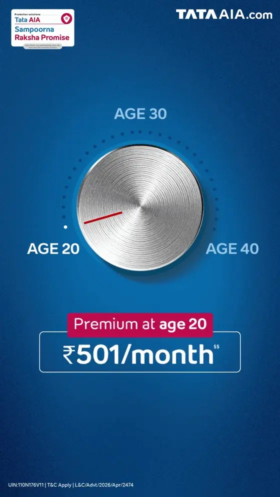

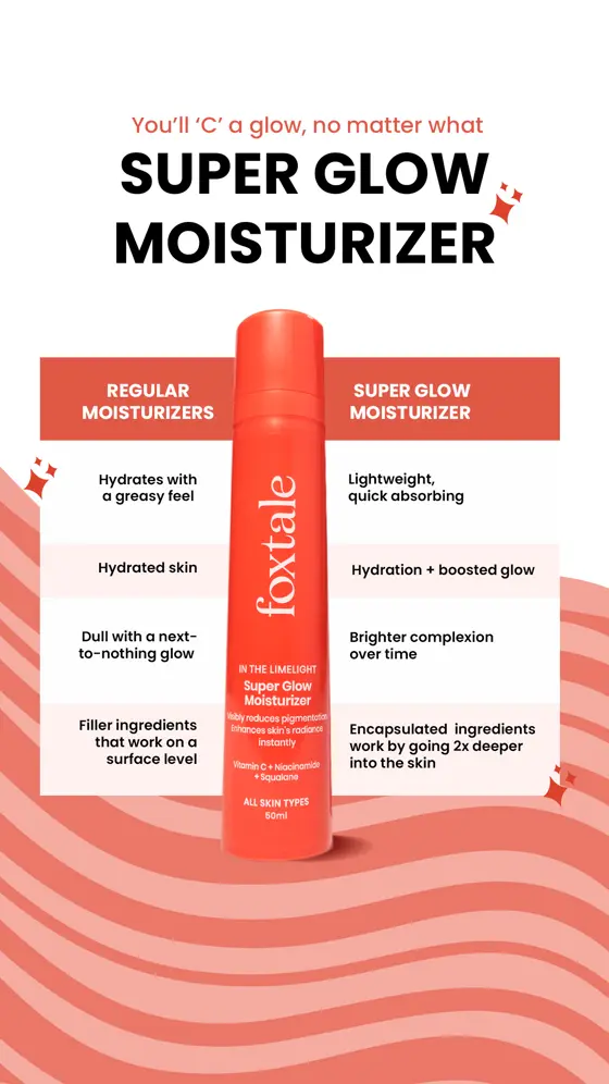
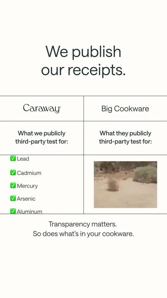
Other formats
Sourced from public ad libraries. The source data carries no visual-format field, so this format is assigned by matching each creative's own description against the taxonomy's vocabulary, which makes the counts indicative rather than exact. Brand pages currently cover the two-wheeler and EV set for Aug 24, 2025 → Aug 24, 2026; the format count above spans every advertiser analysed.